Showing posts with label PPA Challenge. Show all posts

Sunday, November 6, 2011

Mr. Dasher, welcome back.

Its time for Dasher Again!!!
Happy Dance! Happy Dance!
I love him so much.
SO. MUCH.

This week's challenge at the Pals Paper Arts is all about the browns. As soon as I saw these colors I knew what to do. Dasher was made for this!

Don't they look good on him?
Ok, well he'd look good in anything but still, Soft Suede brings out the elegance of his sparkly antlers like no color I've ever seen :)

Here's one last view. Hopefully you can see how the paper is a bit shiny around the edges and on the stamped images?
 I used a bit of Champagne Mist mist shimmer paint (of COURSE he goes for the Champagne. He's so classy!) on a sponge dauber over the inked up stamp for the images. On the edges I used a clean dauber to add some subtle sparkle for the overall shimmery effect.

And I've been holding on to these Mini Vintage Tags forEVER. I should have known my muse would be Dasher!


I used:
* Dasher, Many Merry Messages and Snow Swirled stamp sets
* Soft Suede ink
* Champagne Shimmer Mist and sponge daubers
* Very vanilla, Soft Suede and Early Espresso card stock
* Mocha Morning Designer Paper
* Mini Vintage Tags
* Chantilly Crochet Trim


Friday, September 9, 2011

Halloween Party 2011

Now all I need is a costume and some friends!
The challenge over at Pals Paper Arts is all about Halloween this week. Yay!!!

Which is really great because I've had all this stuff sitting here waiting for me to think of something to make them into. Sometimes it takes a little nudge to get the creativity flowing, you know?
The moment I saw this skeleton stamp I knew exactly what I wanted to do with it. Dress it up and send it out Trick-or-Treating of course!
Hilarious right?


Ok, maybe its just me but still, I'm pretty happy with myself!
Here's the inside:

Here is a dressed up bottle of soda. I just can't help myself sometimes!

And after all that soda, my guests might need some poison. Of course.
How fun is it that these candies (Hershy's Special Dark Pieces) match the colors of the Frightful Sight designer paper almost perfectly!?!

Last but not least, my 'Boo' Banner!
This is pretty simple using the Perfect Pennants die, Frightful Sight designer paper and the Lace Ribbon Border Punch to add a gothic look.

I used:
* Piece of Poison, Spooky Bingo Bits and Lovely Letters Alphabet
* Basic Black, Old Olive, Basic Grey, Cajun Craze, Cherry Cobbler and Whisper White
* Basic Grey and Black Stayz On ink
* Cajun Craze, Basic Black and Old Olive markers
* Frightful Sight designer paper
* Lace Ribbon Border Punch, 1", 1 1/4", 1 3/8", Scallop Circle,
* Crop-o-Dile
* Old Olive 1/4" and 5/8" grosgrain ribbon, Black Striped ribbon, Baker's Twine
* Basic Rhinestone

Tuesday, September 6, 2011

Cat Card from Space for Janet! (and what's up with Basic Gray?)

Seriously, what is up with Basic Gray?
Stampin' Up! has 50 exclusive colors and all of them (except Basic Gray) have an
Adorably Alliterative name.

Think about it: Pink Pirouette, Bravo Burgandy, Old Olive...etc. Alliteration!

Why not Basic Gray? I know the history of the basic colors getting moved into the color families and all of that, but come on! Crumb Cake rose from the ashes of Kraft so I know it can be done. Is Basic Gray just so boring a color that it doesn't deserve the same treatment?

Maybe.

But the Pals Paper Arts design team doesn't think so or they wouldn't have chosen it as one of the colors in this week's challenge.

Ppa color 

Here are some name ideas I thought might spice up poor Basic Gray just a little.
I'll start slow with some nice simple "G" words:
"Galvanized Gray"
"Gallant Gray"
"Gray Granite"
"Grandpa Gray"
"Grizzled Gray"

Or here are some more colorful (haha) idears:
"Barnacled Battleship"
"Cool Cumulonimbus"
"Chubby Cloud"
"Only Overcast"
"Grizzled Grandpa"
"Bottled Brains"

Better right?

Please leave me a comment to help me choose the new name for Basic Grey!  I promise to call it by whatever name gets the most votes forever and ever...or until it really does get a new name.
Feel free to suggest any names I may have over looked or, you know,  just weigh in on which one you like best!

As well as slaving over the fate of Basic Blah...I also made a card!
A Cat Card for Janet, who loves Cats! I love that!
I love people who love things. REALLY love things. It makes the world a special and interesting place to live in. And it also makes me love cats too. So thanks, Janet for making the world a better place.  And HAPPY BIRTHDAY!!!


When I showed this card to my husband (why do I still bother?) he said "It looks like The Cat From Outer Space."
The Cat From Outer Space - classic-disney
And perhaps he's not wrong, but who cares? I like the Cat From Outer Space AND he has an awesome collar. Whatever.

Here's the inside:
You may not be able to see it here but there is a very thin frame of Calypso Coral on the inside, similar to the frame on the front.
And one more picture of The Cat Card From Outer Space:
I'm loving the new Designer Frames impressions folders!

I used:
* C is for Cat and On Your Birthday stamp sets
* Cherry Cobbler, Calypso Coral, Whisper White and Basic Gray card stocks
* Basic Gray ink
* Polka Dots and Designer Frames impressions folders
* Whisper White 1/4" grosgrain ribbon
* Basic Rhinestones

Thursday, August 25, 2011

Daring Adventure and New Stuff!

I've had some of this stuff, unused, just sitting on my table teasing me for weeks now. WEEKS! I couldn't put it away because I wanted to use it, but nothing was really coming to mind so it sort of became part of my work surface. Does this happen to anyone else?
Today's challenge over at Pals Paper Arts was a really great kick to my creativity and as soon as I saw what it was, I knew exactly what I had to do! Yay! The challenge is to "Soften the Edges" which is so great because it can mean so many things. Corner rounding, scallops, ink, sanding, tearing, designer paper, crinkling...etc. I love it!

So I got  out all those unused products and started softening edges (yes ALL of them!) and here is what I came up with:
The new stuff I used tonight includes:
Vintage Trinkets - see those cute little brads and safety pin? I can't believe I've waited so long. They're so fun!
Denim Ribbon - Not the same color? Who cares! Denim matches everything!
Well Worn Designer Paper - Such a nice understated paper. Classy and perfect.

And yes, every single edge on this card has had something done to it. One has been rolled and pinned, some have been textured, most have been sanded and all of them have been inked.
Hopefully these picture show all the edge details.
I feel like I should also mention how great this Daring Adventure stamp set is. This card features all four images: the flourish at the top left, the footprints on the greeting, and the word background. I REALLY love it when a stamp set can be used like this to make a complete project with no wasted rubber. I also love Helen Keller so I might be a bit biased.

I used:
* Daring Adventure stamp set
* River Rock, Cajun Craze, Whisper White,  and Soft Suede card stock
* Well Worn designer paper
* Soft Suede, and Crumb Cake ink
* Vintage Trinkets
* Denim Ribbon
* Distressing kit
* Antique Wallpaper embossing folder

Thursday, August 18, 2011

Boo! Card for the PPA


I just have a quick post tonight of a fun Halloween card I made for the Pals Paper Arts Sketch Challenge. I know its still August and way to early for Halloween, but I am so done with summer that I don't even care. Heck, I even love all the Christmas displays that are out at all the craft stores. Jingle Bells anyone?
All the stamping on this card is embossed a nice shiny black but besides that everything else is super easy.
I didn't even do any distressing or use my Big Shot.
Weird, I know.

Here is the Sketch. So fun right?
Ppa sketch 

I used:
* Spooky Bingo Bits and Tiny Tags stamp sets
* Old Olive, Cajun Craze, Basic Grey, Whisper White  and Basic Black card stocks
* Frightful Sight designer series paper
* Versamark ink
* Black embossing powder
* Embossing Tool
* Black Striped Grosgrain ribbon (so cute!)
* Baker's Twine
* Jewelry Tag punch

Thursday, August 11, 2011

Fall Designer Paper Sneak Peek!

Isn't this paper soooooo pretty!?!

The colors are delicious, the patterns are beautiful and as an added bonus, it matches all the themes from both this year's new fall stamp sets AND last year's Day of Gratitude set. Which is good because I really love this "old" set.
The challenge today over at Pals Paper Arts is to Dress for Success. Dressing for Success is easy as 1-2-3 this week at Pals Paper Arts.  Follow our simple recipe to success:  Use 1 piece of designer series paper, 1 punch and 1 sentiment. 

How great is it that I have such a wonderful excuse to use this pretty pretty paper! Thanks PPA!
I cheated a little because I actually used 2 pieces of designer paper. You can see the the tiny blue border peeking out at the top and bottom? Yep. I couldn't help it. But other than that I followed the 1-2-3 rules perfectly!

The sentiment is stamped on the Wide Oval punch which is framed using a die from the Lots of Tags Sizzlit set. All the edges on the card are filed using a metal precision file from the Distressing kit and inks with Soft Suede and a sponge dauber.
After the edges are all filed and inked the whole thing, inside and out, is splashed with watered down Crumb Cake ink and a light spritzing using Soft Suede and the Color Spritzer tool.
It might be easier to see on the inside but I promise its the same all over.
I used:
* Day of Gratitude stamp set
* Soft Suede, More Mustard and Very Vanilla Card stock
* Spice Cake Designer Paper (2011 Holiday Mini Catalog)
* Soft Suede, Pear Pizazz and More Mustard Markers
* Soft Suede and Crumb Cake ink
* Sewing Machine and thread
* Crochet Trim and Soft Suede Polka Dot ribbon (retired)
* Wide Oval Punch
* Lots of Tags Sizzlit
* Distressing Kit

Monday, August 1, 2011

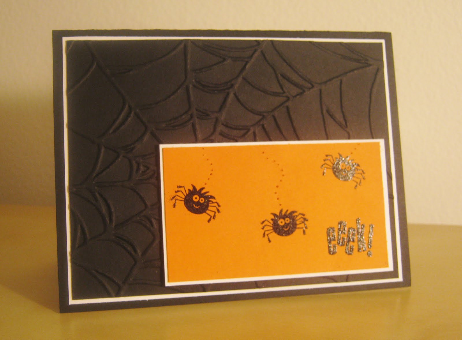
Spooky Bingo Bits, Wild Tarantula and PPA 104!

Is everybody ready for Halloween???

No? Me neither. But I found this in my garage this morning:
It is a tarantula from the hill behind my house. We'll be moving soon. To Antarctica.
So anyway, (shudder) I made this card as therapy to help me calm down a little.
Sadly, I don't have any stamps that say:
"AHHHHHH!!!!KILL IT!!!KILL IT!!!AHHHHHH!!!  IT MOVED!!!AHHHHHHHH!!!!
So I had to settle for "EEK!"
I'm also playing along over at the PPA with today's post. The challenge for the week is all about paper piercing, which until today I was drawing kind of a blank about. So thank you Mr.ScariestSpiderI'veEverSeenWhileNotAtTheZoo for your inspiration. And also for dying. Eventually.

It's hard to capture both the paper piercing AND embossing at the same time in pictures but this one does a pretty good job.

And of course the inside has another embossed spider, just waiting to jump out at you! AHHHH!!!

And because I was having soooo much fun poking holes in my cards, I couldn't help but to make a little ghosty card too! He's so much cuter than a spider!!!
To make the ghosty shape, I just hand drew a ghost (patterned after the ghost in the Spooky Bingo Bits set) the size I wanted onto some scratch paper, used a small amount of snail adhesive to hold the outline paper to my Whisper White card stock and then poked round the outline. Then I used a clean eraser to remove the extra adhesive. So easy and fun!

I used:
*Spooky Bingo Bits stamp set
*Basic Black, Whisper White and Pumpkin Pie card stock
*Versamark Ink
*Black embossing powder, embossing buddy and heat tool
*Large Safety Pin
*Spider Web embossing Folder

Thursday, July 7, 2011

Bringing Baby-PPA 101

More new stuff!!!

The challenge today over at Pals Paper Arts is all about the blues. After staring at these beautiful blues for a minute I just had to make a baby boy card. What else could I do?
And of course I had to use my new a-la-carte stamp Bringing Baby. Woot!

Ppa colors


I used:
* Bringing Baby and Tiny Tags stamp sets
* Night of Navy, Bashful Blue, Marina Mist, Whisper White and Naturals Ivory Card stock
* Marina Mist d.s.p.
* Black Stayz On and Night of Navy ink
* Aqua Painter and Crumb Cake ink
* Blender Pens and Stampin' Pastels
* Color Spritzer tool and Soft Suede marker
* Linen Thread
* Sewing Machine and Thread
* Square Lattice impressions folder
* Jewelry Tag and Extra Large Scallop punches
* Mini Clothespins


Monday, May 9, 2011

3-Way Card and PPA 92

The challenge over at Pals Paper Arts  this week uses these three fantastic colors so of course I wanted to play along! Ppa color
But of course, I couldn't stop with my first draft, I had to keep going. But I'm not really sure the card improved at all from this first simple beauty. After all, sometimes less is more right?
So this is my official submission!
I like that on this simpler version, the Happy Birthday is more of a focal point. This is a technique I often forget about but since I couldn't decide what color I should use, blending all three colors by using markers seemed like a pretty good option.


Here in this second version, I took the brad idea from the main flower and repeated it over on the other side. Of course none of the brads (or the ribbon) are actually the right colors but...meh.


And then in haze of punching flowers, I made this one. The jury is still out for me.
What do you think?
I used:
* Afterthoughts stamp set
* Peach Parfait, Pear Pizazz, Poppy Parade and Whisper White (card stock and markers)
* Blossom Bouquet Triple Layer Punch
* Punch Pack and home office hole puncher
*Certainly Celery 1/8" taffeta ribbon
*Brights Brads


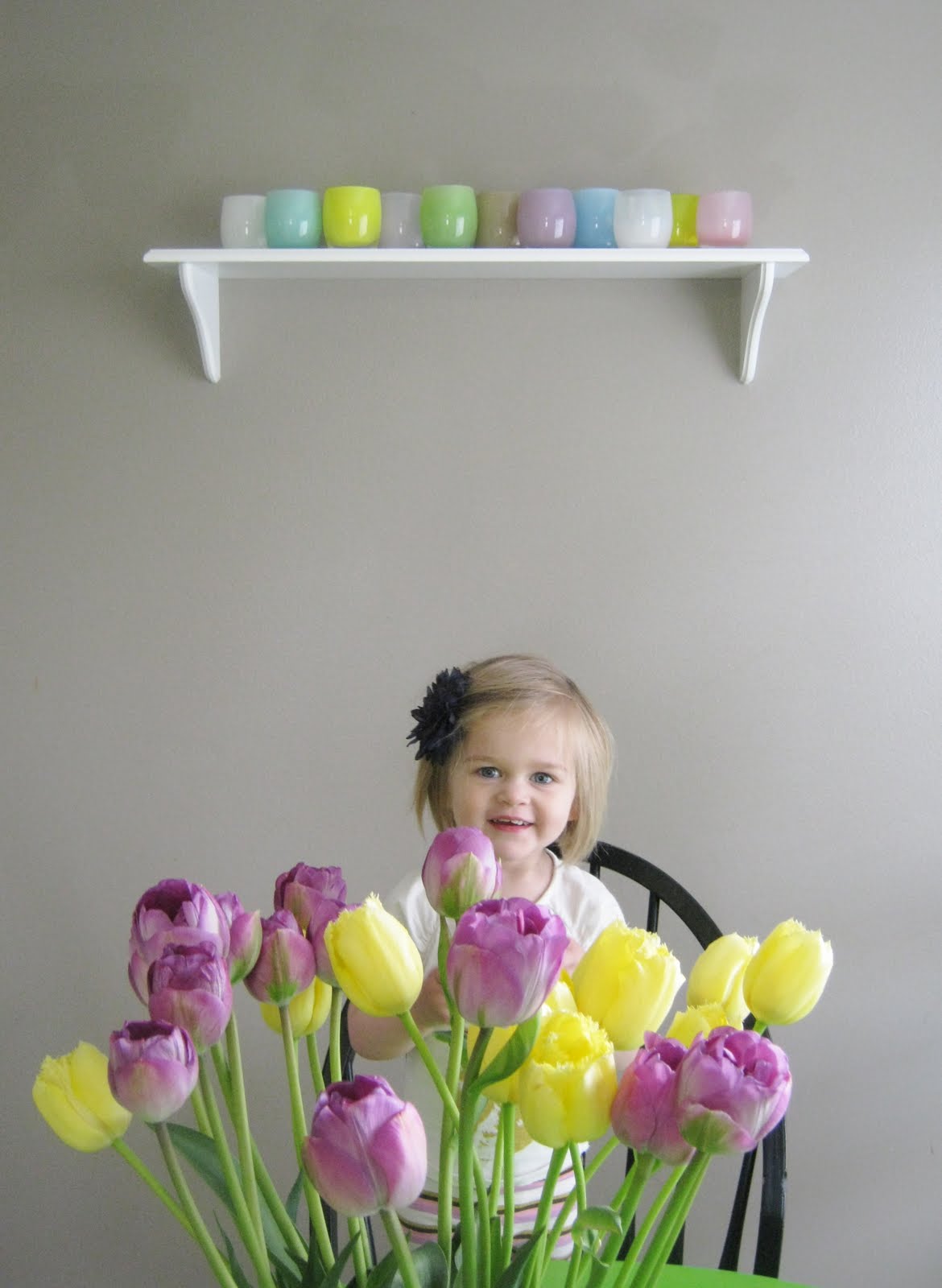
For Mother's Day this year, my husband bought me a new glassybaby, as well as installing this lovely shelf in my dining room to hold some of them. I was trying to take a picture with the tulips on my table as well as my spring glassybaby shelf when my daughter saw me with the camera and assumed it was a photo shoot of her. How could I resist that?

Friday, April 22, 2011

Pendant Park for the PPA 90

The most complicated part of this card was taking a good picture of it! White cards are tricky that way. Also, my camera is crap.  

Its been FOREVER since I last submitted a card to the Pals Paper Arts weekly challenge, but I figured if I'm getting back into the swing of things, I should really start challenging myself again. So, here I am.
Its funny, when I saw this card in my mind it was a lot more complex. It had ribbons and pearls, hand cut images and textured layers. Well, sometimes things don't come out the way we imagine. I just couldn't do any of that with this card. It wanted to be plain and simple and white.
Sometimes I feel this way too.
Here's another picture of it. Like I said, its hard for me to capture the character of a white card. I'll let you decide which photo is best.
This would be a really fun card to demo at a workshop because it uses so few products. Its a perfect project for a brand new stamper to get started with. Now I just need to find a hostess!

I used:
* Pendant Park stamp set
* Whisper White and Pear Pizzazz card stocks
* Early Espresso and Pear Pizzazz ink
* 1 3/4" circle punch

That's IT!!!

Sunday, August 8, 2010

Robots and PPA 54!

This weeks challenge over at Pals Paper Arts is to make a simple and manly card. Is it just me or does this discription sound alot like your husband too? Manly and Simple? Yep. That's him!

If nothing else this card is at least very simple. I think from start to finish it took maybe 15 minutes. To reproduce, it should take less than 5, which is my definition of simple. Yay!
I could see myself giving this card to Josh, except I don't really see myself needing to apologize, but I told him to feel free to use it next time he screws up. With some real flowers too of course.  Heh heh.
Here's a close up of the little bot. I just used some markers to break up the grey and add some whimsy.

I used:
* Lots of Bots stamp set
* Basic Grey, Going Grey and Whisper White card stock
* Basic Grey ink pad
* Poppy Parade and Pumpkin Pie markers
* Real Red 5/8" grosgrain ribbon

Thursday, July 29, 2010

PPA 53 - Purple!

Two posts from me today. Wow!

I made this card for today's Pals Paper Arts challenge. The challenge is to create a monochromatic card using purple. I haven't played along for a while (because most of the time I'm just a little on the lazy side) but today I realy wanted to play because I just purchased my Perfect Plum ink pad and hadn't come up with a reason to use it yet. Thanks PPA!!!


And the cute inside of the card.

I used:
* On Your Birthday and Friends Never Fade stamp sets
* Perfect Plum and Naturals Ivory
*Perfect Plum Designer Paper
* Basic Pearls (LOVE!)
* Two Tags die and Vintage Wallpaper Impressions Folder
*Corner Rounder and Ribbon Border Punches

Thursday, April 15, 2010

Watercolor Trio Sneek Peek and PPA38

Ooooh! I just noticed that this post totally matches my blog backround and header. I feel so special!

I got my May Sneek Peek order today and I was SOOO excited!!! This card uses a new set called Watercolor Trio and guess what...it has three flower images that have a watercolor-ish look to them. Crazy I know. It also comes with a little butterfly stamp and 3 really nice greetings: "Birthday Wishes", "Thanks So Much" and "From the Heart" so really, you can use it for pretty much every occasion!

When I saw that the challenge this week at the Pals Paper Arts would fit perfectly with my new goodies I just had to give it a try!
Because I wanted an even messier/softer look, I spritzed the stamp with mist of water after inking it up. Its such an easy technique and creates such a nice effect.

The other new product I used is the new Square Lattice Impressions Folder. I couldn't help but try it out on the envelope flap too just for fun and I really like the look of it. How nice would it be to get a sweet card with a matching envelope?
I used:
*Watercolor Trio stamp set
*Soft Suede, Sahara Sand, and Pretty in Pink ink
*Soft Suede, Whisper White, and Pink Pirouette card stock
*Pretty in Pink Satin Ribbon
*Metal Frame from an ond Hodgepodge Hardware Kit and the Large Oval Punch

And here's the inside. Hope you like!